What is dark mode?
Most people have heard of this trend by now, and some of you may have tried switching to dark mode already. Or perhaps you have only come across it in entertainment services like Spotify and Netflix, who have been using dark mode as their default since before it had a name.
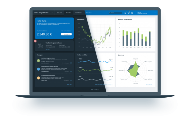
Dark mode is essentially a complementary mode to light mode, or the “standard version” as we refer to it as, that can be used to display a dark version of the user interface (UI), using light text on dark background. Dark mode reduces the light emitted by screens and conserves the energy of devices using OLED or AMOLED displays. When implemented correctly, dark mode can reduce eye strain, especially in low light conditions.
With this in mind, we want to emphasise that the standard version of Nordic Cool which uses dark text on light background, is better in terms of readability and can in fact be easier on the eyes in bright environments. The standard version of Nordic Cool will continue to be the default setting in Visma products, with the option for the user to switch to dark mode.
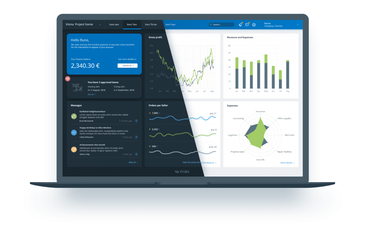
The dark mode version of Nordic Cool will be implemented in a couple of products throughout the year, and we happily welcome your feedback. Whereas the standard version of Nordic Cool has been developed over 10+ years, the dark mode version is brand new, and we have a lot to learn.