Article
10 essential rules for making accessible products
14/5/2023
Innovation and development
Article
10 essential rules for making accessible products
Innovation and development
May 14, 2023

10 essential rules for making accessible products
Innovation and development
May 14, 2023
Article
10 essential rules for making accessible products
Innovation and development
May 14, 2023
Article
10 essential rules for making accessible products
Innovation and development
May 14, 2023
Digital accessibility is one of the hottest topics in the tech industry, yet so many digital products are still not accessible. It can feel like an insurmountable task to overcome. Plus, it can be quite difficult to remember all Web Content Accessibility Guidelines (WCAG) success criteria, and to know which activities create the biggest impact.
To make it easier to digest, here are 10 essential rules to remember. While this list doesn’t cover the full extent of accessibility, it’ll help you keep the most impactful elements in mind through any design, development, or testing decision.
Learn more about Accessibility at Visma1. Use proper HTML markup
The most important tool in your accessibility toolbox is using HTML to its full extent. You get so much out-of-the-box accessibility from HTML – if you use the correct elements and attributes. Using correct HTML elements ensures that sightless users with screen readers have a full understanding of what they’re interacting with.
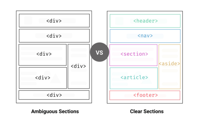
In this case, we’re not just talking about components. Using HTML to properly identify sections will make the overall product more distinguishable for users with screen readers. So, make HTML your best friend and your most important tool. Just as you’d never use a flathead screwdriver for a Phillips-head screw, and you should never use a <div> instead of a <button>.
2. Use ARIA only when necessary
ARIA or WAI-ARIA (Web Accessibility Initiative – Accessible Rich Internet Applications) is a way of enriching components with more information. Its purpose is to give assistive technologies (like screen readers and braille displays) information that goes beyond the visual information.
For example, the HTML attribute “hidden” tells the browser when to exclude something. It’s then hidden from everyone. The ARIA attribute “aria-hidden”, however, only hides content from assistive technologies.
So, when is it relevant to differentiate information to assistive technologies? If we follow the example above, imagine having a dialog pop-up. A visual user can still see that there’s content behind but understands from the visual context to ignore it until the dialog has been addressed. It also eliminates the user interacting with the content behind to some extent.
ARIA should only be used as a last resort, when there is nothing in HTML to create the same behaviour. If an element already has an appropriate label or name, you do not need to use an aria-label. Why? Because aria-labels overwrite any other label, and that can affect the familiar way that users get information from screen readers. As a rule, aria-labels should only be used if a label itself does not convey enough information without the visual context.
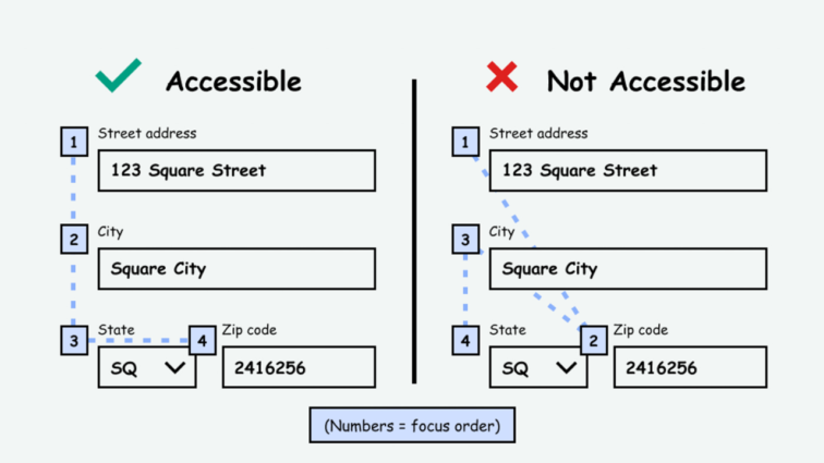
3. Make your product keyboard accessible with a logical focus order
Many users rely on keyboards or other non-mouse tools for navigation. So, it’s crucial that they can navigate in a logical and predictable way. This doesn’t just affect users with disabilities. Many users with heavy input tasks find it better to use keyboards for navigation.
Your job is to make sure that everything can be accessed by keyboard and that there aren’t any keyboard traps. A keyboard trap is a case where a user navigates or is automatically directed to something that keeps the focus order in a loop that the user can’t close without a mouse.
A logical focus order must follow left-to-right and top-to-bottom. When using tabs to navigate, there’s no exception to the rule. Here’s a good example:
You can move the focus based on input. For example, when signing in with a 6-digit one-time passcode, you can move the focus to “Submit” after filling out all 6 digits to surpass any links in between. But, if the user doesn’t fill out all 6 digits or tabbed through the page, the focus shouldn’t surpass the links.
This rule has added benefits. When designing for a logical focus order, you’re forcing yourself to design in blocks, which often makes the design more user friendly.
4. Implement a proper heading structure
One of the most widespread accessibility issues is not having a proper heading structure. It’s also one of the worst issues to have, because screen reader users need a heading structure in order to make sense of the information hierarchy.
A common mistake is to associate the h-tags with visual design. It stems from old coding habits and designers and developers not communicating properly. A designer will probably make three or more heading styles with different sizes, but not necessarily use them semantically. This means that something styled as “Heading 2” can be used semantically both as <h2>, <h3>, <h4> and so on. The best thing to do is use a class to style headings and let h-tags be semantics.
To check that your heading structure makes sense, use a screen reader or a browser extension to review your content.
5. Give all images and icons a proper alt-text or label
We use a lot of images and icons to convey information in digital products. We all know what the gear icon, the pencil icon, and the trash can icon mean. But, imagine if you have seven different things you can delete and every trash can icon is labelled “Delete”. How will you know what you’re deleting without visual context? The answer is: you won’t! It should go without saying that not knowing what you’re deleting can have irreversible consequences.
Actionable icons must have a proper label or description with specific details on what the user is interacting with. Dynamically generated content can use aria-label, aria-labelledby, or aria-describedby (either alone or in combination) to convey the full context.
How to combine aria-label and aria-describedby
Now, what about images? Contrary to popular belief, most images are not purely decorative. They are an important element that provides valuable information to a user. Imagine that you’re shopping for t-shirts. You probably want to know what colour the t-shirt is, right? So do users without sight. Now imagine you’re looking for an apartment to rent. You probably want to see images of the interior, right? Again, so will users without sight.
When dealing with images, ask yourself this question: “Am I, as a sighted user, using the image to get extra information?” If yes, then you need to include a proper alt-text description. If the image is either redundant or decorative, the alt-text needs to be empty – defined, but left empty.
6. Use colour carefully and appropriately
When deciding how to use colour, there are two separate disabilities to consider: low vision and colour blindness.
Colour contrast is probably the accessibility concern with most awareness, because we can all identify with the issue. It’s easy to recognize and fix. An important thing to note is that contrast is not only a requirement between text and background; it’s also a requirement between controls and input and the background. This means that the border around input fields or buttons must have a high enough contrast.
But, contrast isn’t the only colour concern to keep in mind. Colour blindness takes many forms, so you have to think about the colour combinations, as well. Red and green are used throughout digital products to signal success and error, but red-green colour blindness is also the most common colour blindness – affecting about 5% of the population.
This means that you can’t rely solely on colour to convey meaning. For example, if an error occurs, it’s not enough to just make the outline of the relevant fields red. You need to include some other markers, as well. A great error message should include both colour, iconography, and clear text.
The best way to test the colour combinations is with a disability simulator. These simulators show what works and what doesn’t, and can help you choose the best versions of your desired colours.
Tool: Web Disability Simulator
7. Don’t rely on sensory descriptions to direct users
Sensory descriptions rely on a single sense, such as vision, to communicate information to a reader. These descriptions may incorporate the use of colours, shapes, or spatial directions, such as left, right, above, or below.
Now, imagine that you’re using a digital product and the instructions read: “To continue, click the green button below”. For a lot of people, that seems pretty straight forward. But for many others, they can’t recognize that sensory description. By using a colour descriptor, you’re creating a barrier for users with either colour blindness or no sight. Similarly, a user without sight has no way of following spatial directions.
This doesn’t mean that you can’t use sensory descriptions at all. You can refer to “the button below” or “the link above” if you also refer to a text descriptor, like a label. The example from before could be fixed easily like this: “To continue, click the green button below labelled ‘Next’.”
8. Consider users with neurodiversity and neuro-sensitivity
It’s amazing to think of all the ways that the human mind can vary, but it also makes it challenging to put yourself in other people’s shoes. For some individuals, understanding complicated text can be a struggle, and they may become overwhelmed by moving interactive elements or other distractions. Additionally, certain colours, sounds, or patterns can be triggering. When thinking about accessibility for neurodiversity and neuro-sensitivity, the first thing to remember is to keep it simple.
For written content that means:
- Reducing the amount of text
- Writing shorter sentences
- Using simple, short words
- Avoiding industry jargon
- Eliminating unnecessary acronyms
This will help many users with lower reading levels or who struggle with overstimulation.
Of course, there are other things to think about than just readability. In general, you want to avoid putting users in unnecessary stressful situations, such as playing unnecessary sounds, having unnecessary animations, or time limitations.
As with other disabilities, neurodiversity and neuro-sensitivity are not always permanent afflictions. Unfortunately, anxiety, stress, and burnout have become more and more prevalent in our society – all of which can affect comprehension. Software companies that build work-related tools need to be extra mindful of that.
Learn more about neurodiversity in accessibility
9. Give all CTAs and links a contextual label
By now, most content writers know that a “Read more” link will not fly. When users without sight navigate digital products, they will often look for the link menu. If all your links are labelled “Read more”, the link menu will look/sound a bit like this:
Link, “Read more”
Link, “Read more”
Link, “Read more”
….
Similarly, if you have a list of items all with a CTA that says “Open”, “Download”, or “Add to cart”, screen reader users won’t know the difference without a context.
You can still use links and CTAs with short descriptions like “Go”, “Watch now”, “Next”, and “Learn more”. You just need to figure out if more context is necessary to get the message across clearly. This is usually not a problem visually because the visual context makes it clear what the link or CTA will do. But, that’s not always the case on screen readers.
The way to give extra context is to use either aria-label, aria-labeledby, or aria-describedby – alone or in combination. Visually, a button or a link will say, “Learn more”, but with one or more aria attributes, it will read “Learn more about xxx”.
10. Test the accessibility of your product
Accessibility QA testing can, at times, feel insurmountable. When products are already built, in most cases without much focus on accessibility, starting to assess their accessibility is a large undertaking. And fixing all the accessibility issues is an even greater one.
Ideally, accessibility QA testing should be part of every development cycle. This way, you ensure that every element of the UI is accessible as it’s being implemented. If you have products that are already built and released, you should still invest the time and resources to do accessibility testing.
Define a scope of maximum 10 different interface types. Select the most-used features and most-viewed pages to achieve the biggest impact. Just make sure that you cover as many different content styles and component types as possible because accessibility issues will be relevant throughout the product and not just within the limited scope.
Accessibility is much more than compliance. It’s about the ethical task of making products inclusive. So, it’s important to do both accessibility QA testing and accessibility user testing (in that order) to make sure you’re enhancing the user experience for those who need it most.

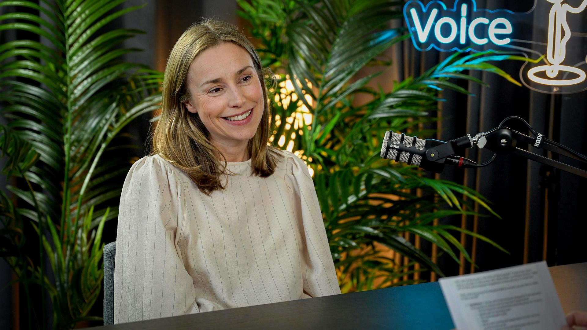
About the episode
Julie Rasmussen
Voice of Visma
We're sitting down with leaders and colleagues from around Visma to share their stories, industry knowledge, and valuable career lessons. With the Voice of Visma podcast, we’re bringing our people and culture closer to you. Welcome!
Diana Kigyossy
Benedikte Lyngbø
Holli Hatherly
Berit Braut
Mandy Burger
Victoria Bondarchuk
Jet Bouwman
Brian Ye
Lilja Helgadottir
Carina Ramsøy
Kejsi Gjordeni
Martin Olstad
Claus Dahl
Vlad Boldura
Kaja Falck-Ytter
Linn Kjærland
Ida Nicoline Glosimot
Stina Wahlsten
Pieter Bijl
Emily Northway
Rie Jørgensen
Henriette Veiby
Magnus August Lien
Philip Scarampi
Ari-Pekka Salovaara
Helle Hobbelhagen
Alexander Lystad
Ida Strande Markman
Amanda Lundius Mörck
Isabel Arkvik
Gina Ross Eriksen
Juliette Prado
Anne-Grethe Thomle Karlsen
Julie Rasmussen
Related content