Article
Pushing our buttons: How we design for accessibility
18/5/2022
Innovation and development
Article
Pushing our buttons: How we design for accessibility
Innovation and development
May 18, 2022
Pushing our buttons: How we design for accessibility
Innovation and development
May 18, 2022
Article
Pushing our buttons: How we design for accessibility
Innovation and development
May 18, 2022
Article
Pushing our buttons: How we design for accessibility
Innovation and development
May 18, 2022
This article is a joint collaboration between Julie Utgård, UX Designer, and Ieva Ozolīte, Lead Front End Developer.
WCAG (Web Content Accessibility Guidelines) is a set of standards made to measure accessibility. In line with EU regulations, Visma performs to WCAG level AA requirements, and in some cases above these, for our websites and products.
WCAG is built around four core principles:
- Perceivable – so people can see or hear the content
- Understandable – so people get clear and simple language
- Operable – so people can use it by typing or by voice
- Robust – so people can use different assistive technologies
By designing in line with these principles, we ensure that we meet all the needs of the millions of people who use our products and websites. We can give people with disabilities the possibility to start a business of their own, to apply for a job as everyone else, or to continue their work even though they have a temporary disability. So it’s needless to say we take it seriously, and although we haven’t completely reached our accessibility targets, we are continuously working towards them.
What we’ve also seen is that by designing for accessibility, other users benefit too.
WCAG + affordance
When an object gives a clue about how it should be used, we can say it has a certain Affordance. We know the flat end of a fork is for holding and the other end is for piercing food, thanks to its affordance. Similarly, we know what is clickable on a webpage because there are various cues telling us. Potentials for interaction are collectively called the affordances of an object.
Websites are all about clicks, so accessibility and affordance in clickable elements are an important part of our work when we design for websites. The main clickable elements are links and “calls to actions” (CTAs), which are usually shown as a designed link or button design.
Accessibility principles: perceivable, robust = We need to make functions and actions consistent and easy to perceive, even if you are using assistive technology, are colourblind or have cognitive disabilities.
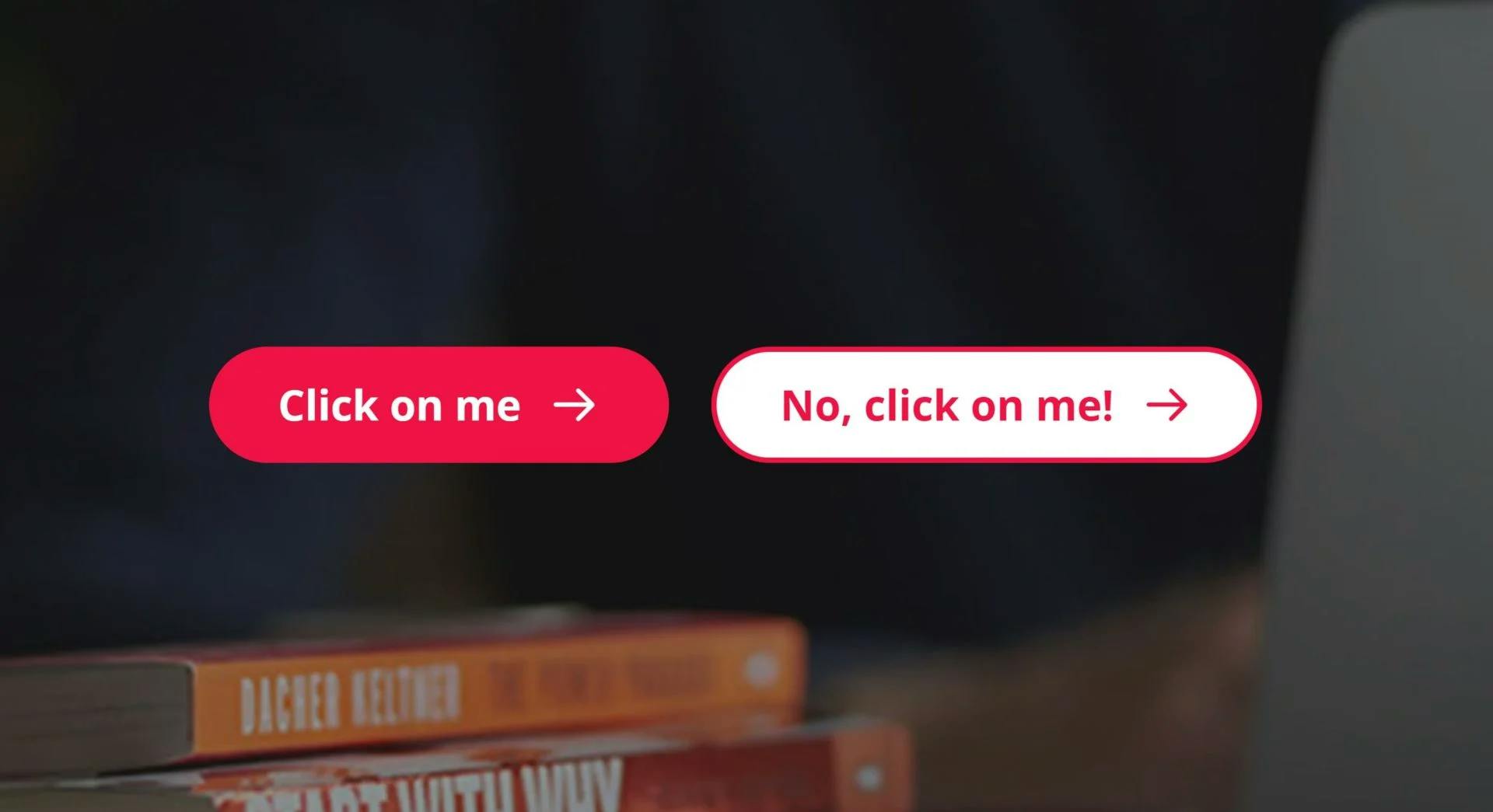
Links and button design
Links
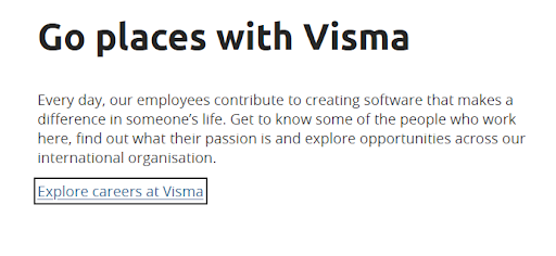
Links should look like links, and not look like something else. They should stand out. Users may get frustrated if they try to click on textual phrases or graphics that look like links but are not. They will also be frustrated if they have to move their mouse all over the page trying to discover links.
WCAG guidelines state that links must present a “non-color designator”. Based on a person’s abilities (colour blindness, blurry or low vision) and environment (poor lighting, small screen, etc.), links could become unidentifiable, when relying only on the colour. This is why we have added an underline to all textual links. Highlighted CTA-links have an arrow in addition to colour.
All links should also have a hover state and focus state. These effects help users know that the item can be clicked and that the mouse focus is on a particular link. Focus state is especially important when using a keyboard to navigate the page. A prominent focus state signals which item you are interacting with, and makes it easier to navigate around.
Although browsers have inbuilt styles for links and all interactive states (hover, focus, active), those default styles vary depending on the user’s browser and operating system. To have a more consistent look and feel, we use our own visual styles.
Default focus states in different browsers:
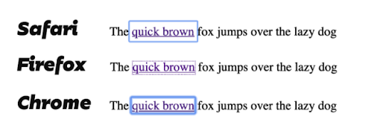
Focus state on Visma’s web pages:
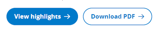
Buttons
There is often a difference between buttons one sees on a web page. Some perform an action on the page you’re on, like submitting a form or expanding a section. Others link to a different page. In the latter case, the buttons are actually by definition not buttons at all!
This means we need to give additional visual cues that this is in fact a link and not a button. This is why we have added a cute little arrow in all our “link-buttons”:
Link Text
The visual appearance of links is an important part of the accessibility requirements on the web and is taken care of in the code. But the link text is also part of the accessibility, and that part depends on the content creator. So there are best practices for creating user-friendly link texts.
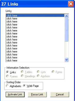
Screen Reader users often navigate pages going directly from link to link, skipping the text in between. It means that the user does not know the context surrounding the link.
That’s why it is important for link text to make sense without the surrounding sentences or content. The link text alone should convey the function and purpose of the link and it should also be unique and easy to speak out loud. For example, non-informative phrases such as “click here” and “more” are ambiguous when read out of context.
Here’s what a user might see if they view a web page’s links via their Screen Reader, and the content creator has not made the link text accessible:
Accessibility is a collective endeavour
Accessibility in products and web pages is a responsibility that goes across the team. Everyone needs to be involved, whether they’re in design, UX, development, testing, content, or product ownership. It requires us to collaborate and attack the task from many angles. But by doing so, we create a great experience for those with disabilities, and an even better experience for everyone else.

About the episode
Julie Utgård
Voice of Visma
We're sitting down with leaders and colleagues from around Visma to share their stories, industry knowledge, and valuable career lessons. With the Voice of Visma podcast, we’re bringing our people and culture closer to you. Welcome!
Diana Kigyossy
Benedikte Lyngbø
Holli Hatherly
Berit Braut
Mandy Burger
Victoria Bondarchuk
Jet Bouwman
Brian Ye
Lilja Helgadottir
Carina Ramsøy
Kejsi Gjordeni
Martin Olstad
Claus Dahl
Vlad Boldura
Kaja Falck-Ytter
Linn Kjærland
Ida Nicoline Glosimot
Stina Wahlsten
Pieter Bijl
Emily Northway
Rie Jørgensen
Henriette Veiby
Magnus August Lien
Philip Scarampi
Ari-Pekka Salovaara
Helle Hobbelhagen
Alexander Lystad
Ida Strande Markman
Amanda Lundius Mörck
Isabel Arkvik
Gina Ross Eriksen
Juliette Prado
Anne-Grethe Thomle Karlsen
Julie Utgård
Related content